Project Photos
Distinct HealthCare, a leading healthcare provider dedicated to digital, technology-powered medical services in China, operates nearly 30 clinics offering multiple specialist treatments in 11 major cities. With patient-centered design as its core value, Distinct HealthCare seeks to develop a thoughtfully designed clinical space to provide patients with a comfortable and pleasant experience.
B+H was commissioned to design Distinct HealthCare’s new clinic in Wuhan. The 1,400-sqm clinic consists of an Aesthetic Center, Day Surgery, the Well Child & Dental clinic, and a Medical Centre, providing one-stop healthcare services to the growing middle-class market. Based on a precise and comprehensive understanding of the clinic’s positioning, B+H’s design solution revolves around patient experience with attention to comfort and emotional wellbeing.
Drawing from existing design style guidelines for Distinct HealthCare’s clinics, B+H envisions an elevated and refreshed look for this new clinic by combining aesthetics and functionality. Shapes, lines, and color are meticulously orchestrated into a design language, and thus, humanistic care is delivered thoughtfully.

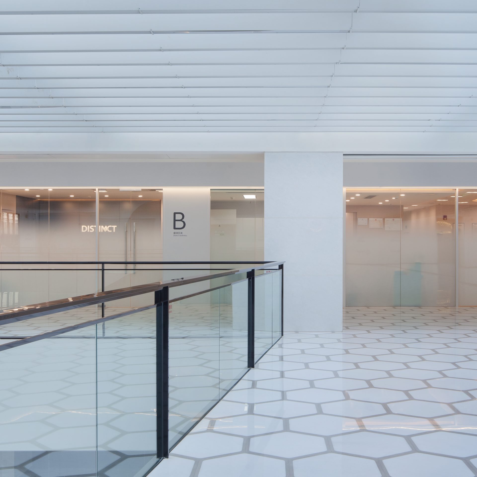
Distinct HealthCare’s brand identity is communicated through every aspect of the interior design. The main entrance delivers a positive first impression by creating a welcoming and inclusive feel. Each zone is identified through a single letter, which offers stress-free navigation to the visitors.

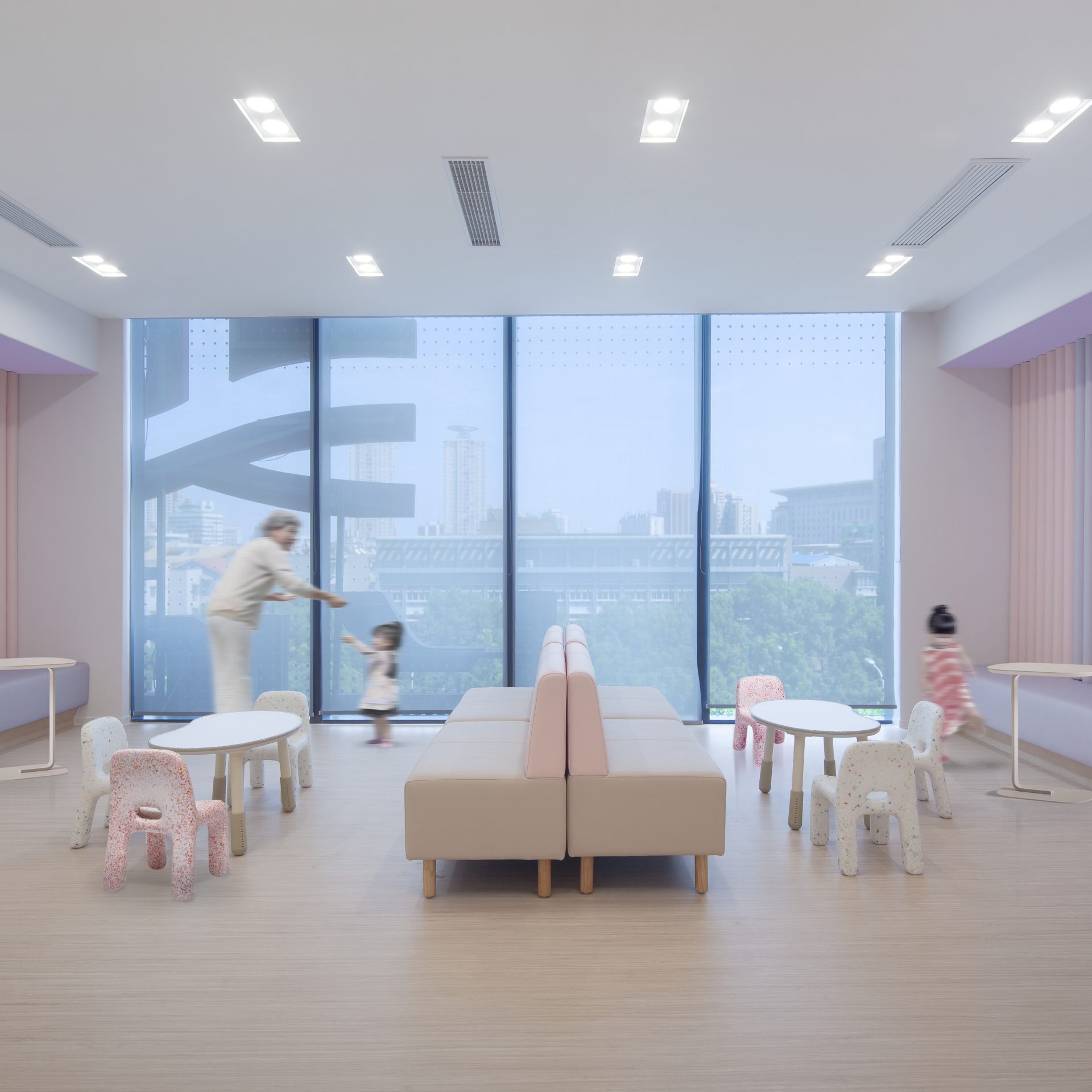
The extensive use of circular elements and gentle curves create a calming, relaxing, and homelike ambiance within the clinic. Streamlined shapes and round corners convey a sense of security and instill a positive emotional connection between the patients and the medical staff. This concept is also extended to the selection of furniture. The round-shaped contemporary-style furniture helps alleviate patients’ anxiety and stress by creating softness and harmony.
Colors are assigned to different departments to reinforce wayfinding and help patients and staff navigate the clinic with ease. The pastel colors evoke an uplifting environment, distinguishing this family-oriented healthcare center from traditional hospitals.
Each division’s color tone and materials selection is curated to best match their respective functions. For example, soft materials and bright color themes are applied in the Well Child clinic to facilitate the healing process, while sleek lines and polished surfaces project an elegant image for the Aesthetic Center.
Metal and glass are appropriately blended with wood laminates, vinyl flooring and upholstery. These materials were carefully selected for their functionality and ability to be easily cleaned, providing a safe environment while creating a natural yet stylish appearance for the clinic. Gradient glass partition walls allow light and privacy and minimize noise disruption. The just-right transparency provides both perceived openness and assurance.